ZARA Redesign
Role: UX Designer, UX Researcher, Product Designer
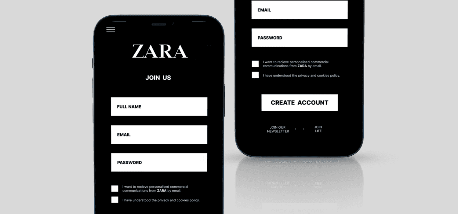
User challenge: To redesign Zara's sign-up page on their mobile app to make it more user-friendly and accessible.
Role: UX Designer, UX Researcher, Product Designer
Tools: Figma, Maze
Timeline: 1 week
Overview
I chose to redesign Zara's sign-up page to make it more user-friendly and accessible. The original design lacked usability, and I saw an opportunity to implement small but impactful changes to create a smoother sign-up experience for users.
Intentions for Redesign
To improve the overall structure of the sign up page
To improve the signing up process for users
To make the sign-up page accessible
Problem Statement
The current sign-up page on Zara's mobile app lacks user-friendliness and accessibility, leading to a friction filled sign-up process. Users may experience frustration due to unclear navigation and design elements that do not prioritise ease of use. The goal is to redesign the sign-up page to enhance its usability, ensuring a smoother, more accessible experience that encourages users to complete the registration process with minimal effort.
Final Design
The goal was to redesign a sign-up page, making it as user-friendly and accessible as possible. As a frequent user of the app, I noticed that the sign-up process was not seamless, with small buttons that made navigation difficult. To address this, I implemented the following improvements:
Larger buttons for easier interaction
Reduced personal information required for sign-up
Improved spacing using containers and alignment for a more structured layout

Final Thoughts
Throughout the process, I honed my design skills, improved my ability to position elements effectively, refined my design thinking, and enhanced my colour selection and layout creation.
Contact
