PLT Case Study
Role: UX Designer, UX Researcher, Product Designer

User challenge: To redesign the popular PLT app and website.
Role: UX Designer, UX Researcher, Product Designer
Tools: Figma, Maze
Timeline: 2 weeks
Overview

Introduction
PLT is an international online fast fashion company co-founded in 2012 by Umar Kamanu and Adam Kamani, targeting women between 16 and 35 years of age. The company currently operates in the United Kingdom, United States, Australia, Middle East, France and Canada, with the most number of users being from the United Kingdom. PLT has rapidly expanded into one of the most well recognised online fashion brands, with 6.8 million active customers and an impressive 38% revenue growth since starting.
Intentions for Redesign
To gain an understanding of the PLT website and app user experience
To improve users online shopping experience
To increase sales for all clothing types
To reduce contact centre inquiries
To increase referrals
To create a functional platform for users
Problem Statement
- Loading and button issues
- Returns process is difficult to find
- Too much white space at the bottom of homepage
- Website and app is overwhelming to look at
- The ‘shop the look' section needs improving
Design Process
Stage 1: Discovery
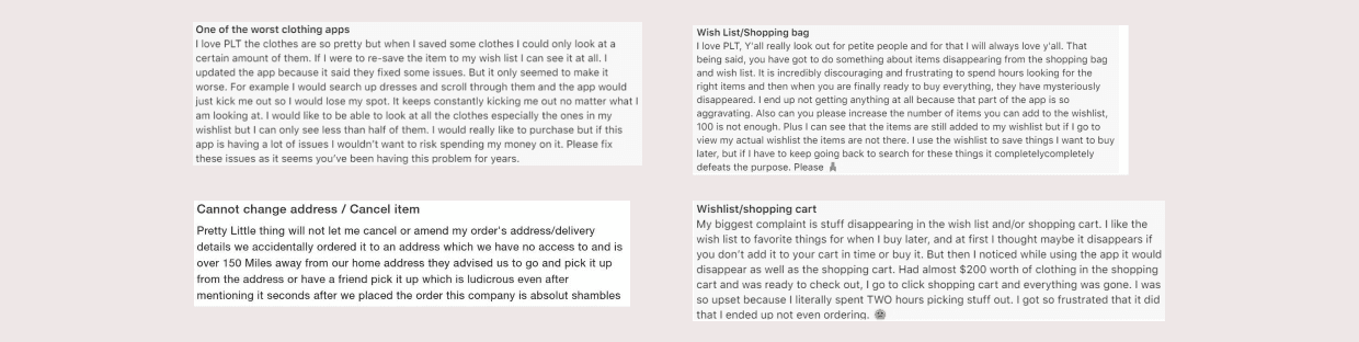
Analysing Reviews
- The incapability of altering the address or cancelling items
- Items vanishing from the wish list and shopping bag
- The app navigating users away from their current page
User Questionnaire
- What is your age range?
- Do you shop on PLT often?
- Do you prefer shopping on PLT app or website?
- What do you use the app/website most for?
- Do you complete purchases on PLT or do you leave products in the basket/wish list?
- Do you find the PLT app/website easy to use?
- Why do you find the app/website hard to use?
- What do you like the least about the PLT app/website?
- Tell us about a bad experience you’ve had with PLT.
Answers from Questionnaire
- An oversaturation of content on the website and app
- Accessibility issues
- App failure mid-use
- Cheap branding
- Inability to find products when searching
- Stock issues
- Confusing checkout process
Competitor Analysis
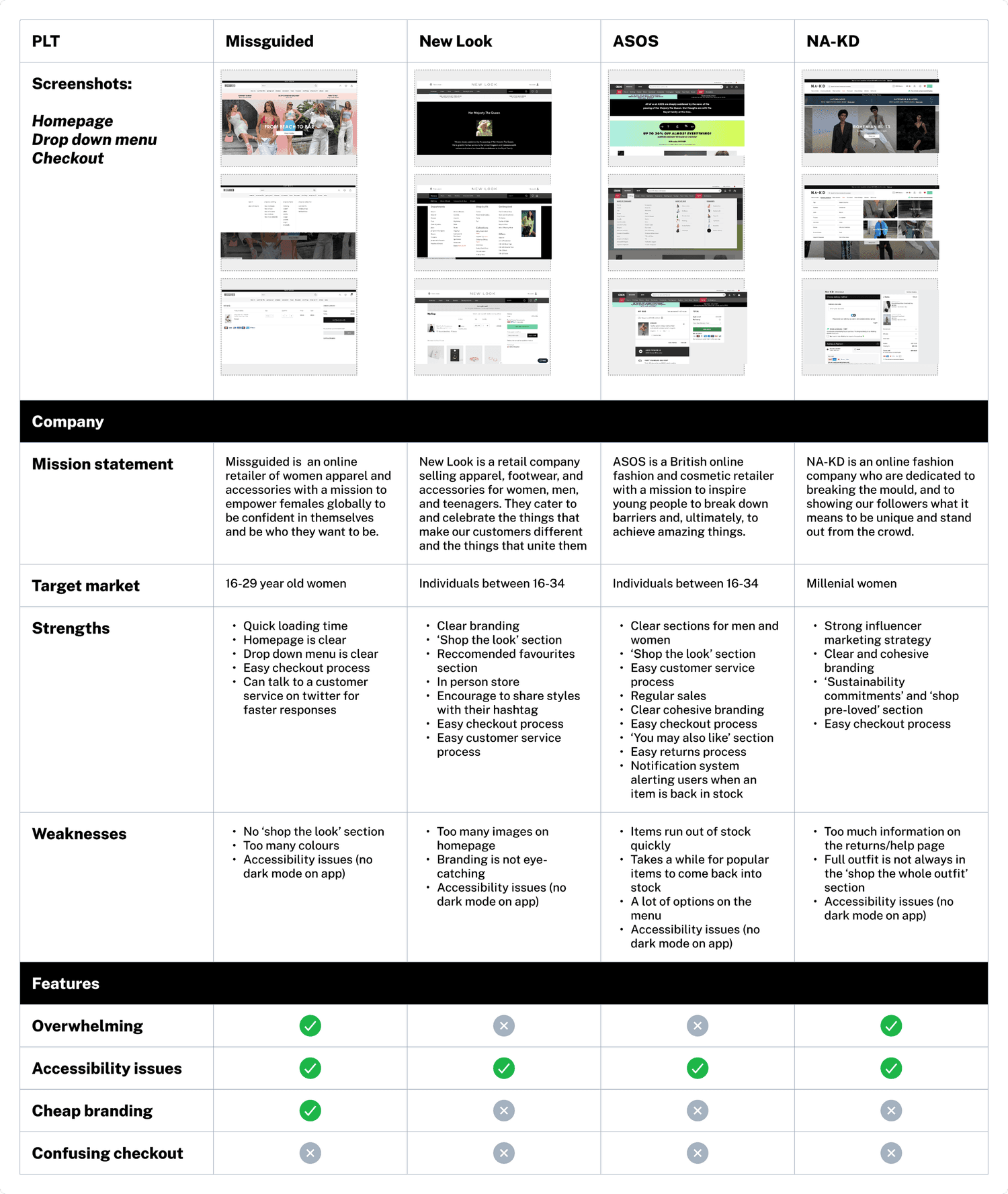
- All competitor’s had accessibility issues due to no dark mode option on their app
- Similar to PLT, Missguided’s website and app was overwhelming due to an oversaturation of content and branding looked cheap
- NA-KD fashion website and app was overwhelming due to several large images on the homepage
- Unlike PLT, all competitors had an easy checkout process
Heuristic Evaluation
- The app took an average of 6 seconds to load (the typical app loading time should be around 2 seconds)
- A dark mode feature was not available
- The 'select size' function failed to load
- No alert options exist for items returning to stock
- The accuracy of the 'shop the look' feature was inconsistent
- If an item gets accidentally removed from the basket, there's no undo function
- The homepage is chaotic with an excessive amount of choices in the drop-down menu
- Clicking on an item from the wish list and then returning sends you back to the first page, not the previously visited page
- The site load time was around 3 seconds
- The 'get the look' section isn't consistently precise
- The homepage appears to be quite cluttered
- There's no feature to switch the app to dark mode
- There are no alerts for when a product is out of stock
- There's no undo action if you accidently remove an item from your cart
Stage 2: Define
User Persona
I needed to visualise the users and understand their frustrations, goals, personality, and backstory so I created a user persona to do this.


Affinity Mapping
To begin the affinity mapping process, I revisited the user questionnaire and transferred the user's feedback to sticky notes to discover recurring patterns.
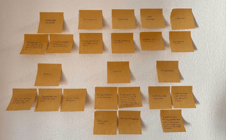
Here are 7 pain points I discovered from the user questionnaire:
An oversaturation of content on the website and app: A range of users communicated that the PLT website and app was overwhelming to use and look at. They also stated that the layout was not simple, therefore, they did not want to make a purchase.
Accessibility issues: One user shared that the PLT app and website was not accessible to them as they’re visually impaired and light mode was the only option.
App failure mid-use: One user shared that the app frequently shut down mid-use.
Cheap branding: One user shared that the branding looked cluttered and cheap, therefore making it less likely to make a purchase on the app or website.
Inability to find products when searching: Users shared their frustrations of finding it overwhelming to browse. Users also stated that sometimes they type the exact name of the product and it cannot be found.
Stock issues: Users conveyed that their size is always out of stock and that items will state they’re in stock when in fact they aren’t. Users also shared their frustrations of not having a notification button when items are back in stock.
Confusing checkout process: One user shared that the checkout process was very confusing.
User Suggestions
Users shared that they would like to have recommended products based on what they put in their shopping basket, order history or wish list to make the process more personable. Users also stated that they would recommend a dark mode that stays in line with the PLT branding and a better way to filter to make the search process easier.
How Might We Statements (HMW)
Before moving onto the develop stage of the case study, I created HMW statements to generate the best possible solution for the users and keep a human centred approach.
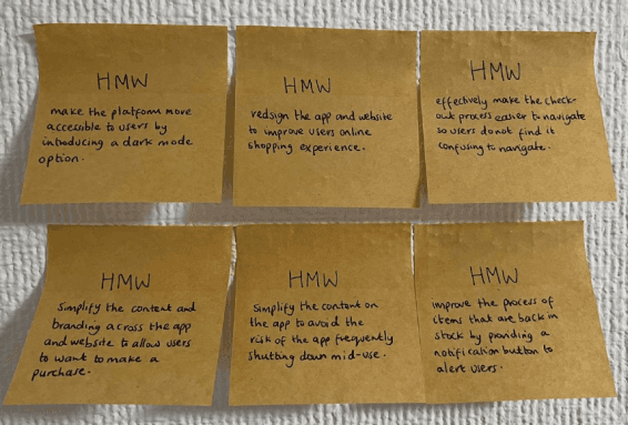
After going through the HMW statements, I chose the following statement:
Stage 3: Develop
Mind Map
The first part of the develop stage was to gather my ideas and create a mindmap.

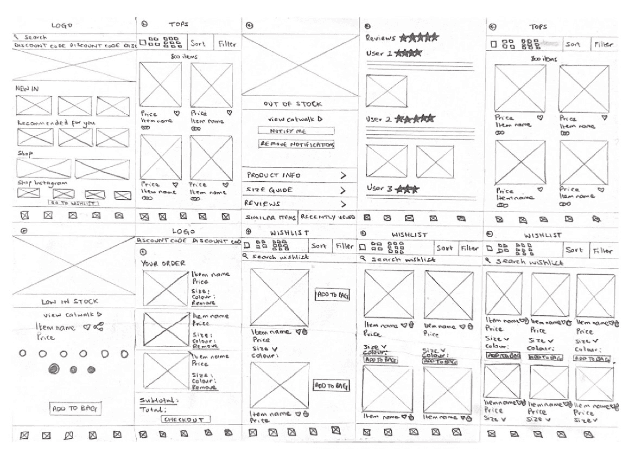
Wireframes
For the next step, I transferred my ideas from the above mind map onto low-fidelity wireframes. After this, I went on to create medium and high-fidelity wireframes.

Usability Testing
I used Maze for the next stage in the case study. I created a prototype and tested with 9 users by providing clear instructions on the path.
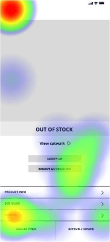
From reviewing the results, I noticed that some users had difficulty clicking the ‘reviews’ section on the app. As you can see from the image below, the heatmap shows that some users clicked on the word ‘reviews’ and some clicked on the arrow. One user stated that they clicked on the review bar thinking it would expand, and another user stated that they would’ve preferred if the entire row was clickable to avoid confusion.
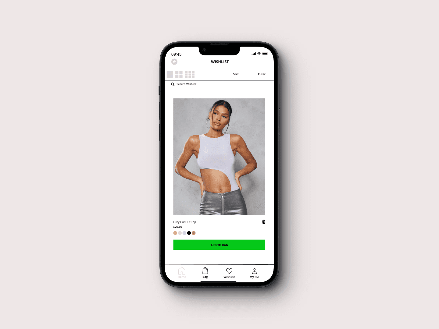
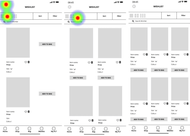
When designing this app, I included an option to change the overall page layout in the wish list. From the data in the usability test, users found this option useful, which was a good result considering a lot of users had issues with an oversaturation of content on the website and app.
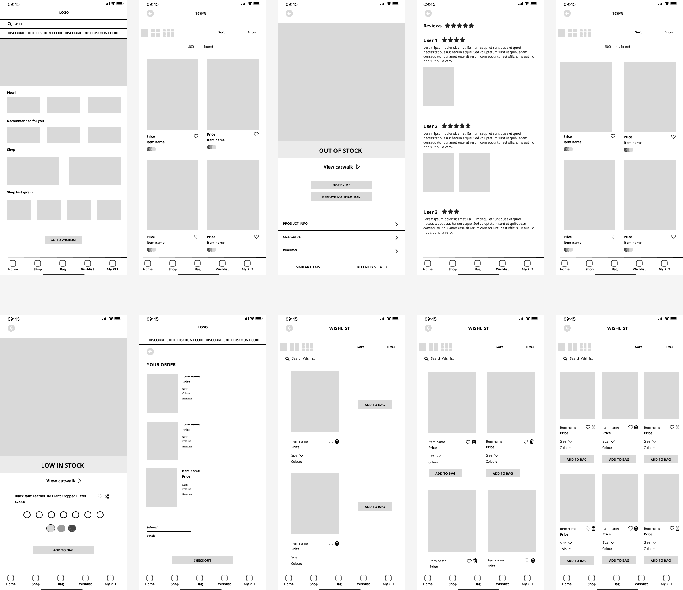
Stage 4: Deliver
The goal of the redesign was to simplify both the app and desktop, which users found overwhelming and difficult to navigate. Through thorough research, it became clear that users also felt the branding appeared cheap, contributing to a less-than ideal user experience.
In response to this feedback, I implemented several key changes to enhance both usability and aesthetics.
The homepage layout was refined with clearer subheadings and a more structured design, reducing clutter and improving navigation.
A ‘shop Instagram’ section was introduced to create a seamless shopping experience that better integrated with the brand’s social media presence.
To address frustrations around stock availability, an out of stock banner and a ‘notify me’ button were added, ensuring users could easily identify unavailable items and take action.
The layout for similar items and recently viewed products was redesigned for better clarity, with a new ‘review’ section encouraging user engagement.
Wishlist management was also improved with enhanced product views, a search function, and a simpler way to remove items.
The checkout process was streamlined to reduce cognitive load, making it more intuitive and efficient for users.

The Result
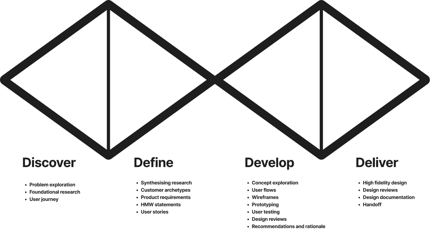
Redesigning PLT was a valuable learning experience. Using the Double Diamond method, I structured the project effectively and maintained clear communication with users, leading to better results.
The goal was to improve the user experience on PLT’s desktop and mobile app, making the platform more intuitive and boosting sales. A key challenge was the cluttered layout, which I addressed by simplifying the design for smoother navigation and reducing user stress. I also introduced a dark mode option and refined interview questions and testing instructions for clarity.
This experience reinforced the value of user-centric design, and I will continue refining the process for both users and myself.
Thanks for reading!
Contact
