User challenge: To create a user-friendly app and website that helps individuals feel supported on their skincare journey.
Role: UX Designer, UX Researcher, Product Designer
Tools: Figma, FigJam
Timeline: 2 weeks
Overview
For this case study, I've been given a task to create a user-friendly skincare company inclusive of all skin types that aims to help individuals feel supported on their skincare journey and easily shop for products without feeling frustrated.
Introduction
The skincare industry is one of the biggest and profitable industries in the world, with the largest global market being in the US, followed by Japan. According to Statista, the UK skincare industry was valued at approximately £107.46 billion last year, and £3.1 billion in the year 2021. One of the biggest skincare concerns globally is acne, with approximately 95% of people aged 11 to 30 being affected according to the NHS. Therefore, it is important that individuals have knowledge on what products work best for their skin, what services are readily available and the best skincare routine.
Establishing a good skincare routine is essential at any age as overtime the skin's collagen and elastin production declines. Being knowledgeable about the products you put on your skin, understanding what products work best with your skin type and having a good skincare routine will help your skin look and feel good throughout your life. It is for the above reasons, that I will create an app that aims to minimise people’s skincare concerns, allowing them to feel supported on their skincare journey.
Intentions for Design
For this case study, I intend to minimise people’s skincare concerns by providing a user-friendly platform for them to feel supported on their skincare journey, as well as being able to shop for products easily and efficiently. I will do this by conducting extensive research, making the app accessible for users, and provide them with an education and support platform within the app.
Problem Statement
People who are experiencing skincare concerns need a platform where they feel supported and can easily shop for products suitable to their skin type.
The Company
LUNA Skin is a user-friendly skincare company that minimises people’s skincare concerns and helps them easily shop for products suitable to their skin types. At LUNA Skin we plan to help users feel supported on their skincare journey, make the shopping experience quick and efficient, and educate users by providing access to educational resources.
As a UX/UI designer in this case study, I will be identifying problems associated with those experiencing skincare concerns and create a problem based solution for users. LUNA Skin aims to be engaging, visually pleasing, easy to use, accessible, and a go to space for those who need support.
Hypothesis
For this case study I will be carrying out primary and secondary research from relevant resources, businesses and users. I will then collect this information and create an app and website that supports users on their skincare journey.
I am to create:
A solution for users to feel supported and minimise their skincare concerns
A user-friendly, engaging and accessible platform for users with visual, auditory or any other disability
A platform that is a go to space for users with educational resources and a support space
A platform that appeals to users of ages 16-35
A platform that is visually pleasing and easy to use
Business Research
Ideas
Before conducting my user research process, I used FigJam to create a mindmap of ideas (see below).
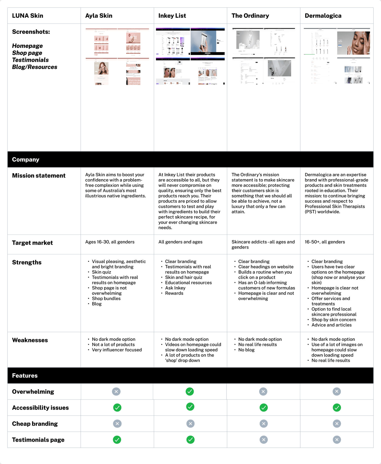
Competitor Analysis
The first step of the user research process was to carry out a competitor analysis to evaluate LUNA Skin’s direct competitors such as Ayla skin, Inkey List, The Ordinary, and Dermalogica. The reason for carrying out a competitor analysis is to gain a clear understanding of LUNA Skin’s competitors' strengths and weaknesses in order to identify a gap in the market.
From carrying out a competitor analysis, the following themes were discovered:
One in four competitors' websites felt overwhelming due to excessive content on the homepage
One competitor lacked a blog, while two featured a testimonials page showcasing real customer results
All competitors had accessibility issues, as none offered a dark mode option. However, their branding was consistently clear
All competitors' target audience was for all genders
User Questionnaire
To validate my problem statement, I conducted a user questionnaire with participants aged 16-35. Below, you can see the results.
From the questionnaire, I found that:
One user would benefit from a private profile to track their skin’s response to products
Two-thirds of users prefer seeing more reviews and real results
All three users indicated that visual aesthetics are important when buying skincare online
50% of users shop for products weekly, and 16% bi-weekly
Half of users feel supported with their skincare needs, while the other half do not
50% would benefit from a support group, the other 50% wouldn’t
66% of users buy skincare online, while 33% prefer in-store shopping
83% prefer browsing on desktop rather than the app
All users find it easy to shop for products suited to their skin type
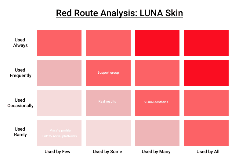
Red Route Analysis
I conducted a red route analysis to identify the key features that users need most. This analysis provides valuable insight into user priorities, helping me assess and prioritise the essential features for the app, ensuring its effectiveness. To gather reliable information, I included 6 participants aged 16-35 who frequently shop for skincare products, allowing me to create an accurate and dependable table to guide the app’s development.
Results
Based on the red route analysis results, I identified the key features to include on the website and app to maximise user benefit. To ensure they are user-friendly and functional, the branding must be eye catching, the homepage simple and effective, the personal profile and support group easy to navigate, and resources easily accessible. Additionally, the app and website must be accessible to all users.
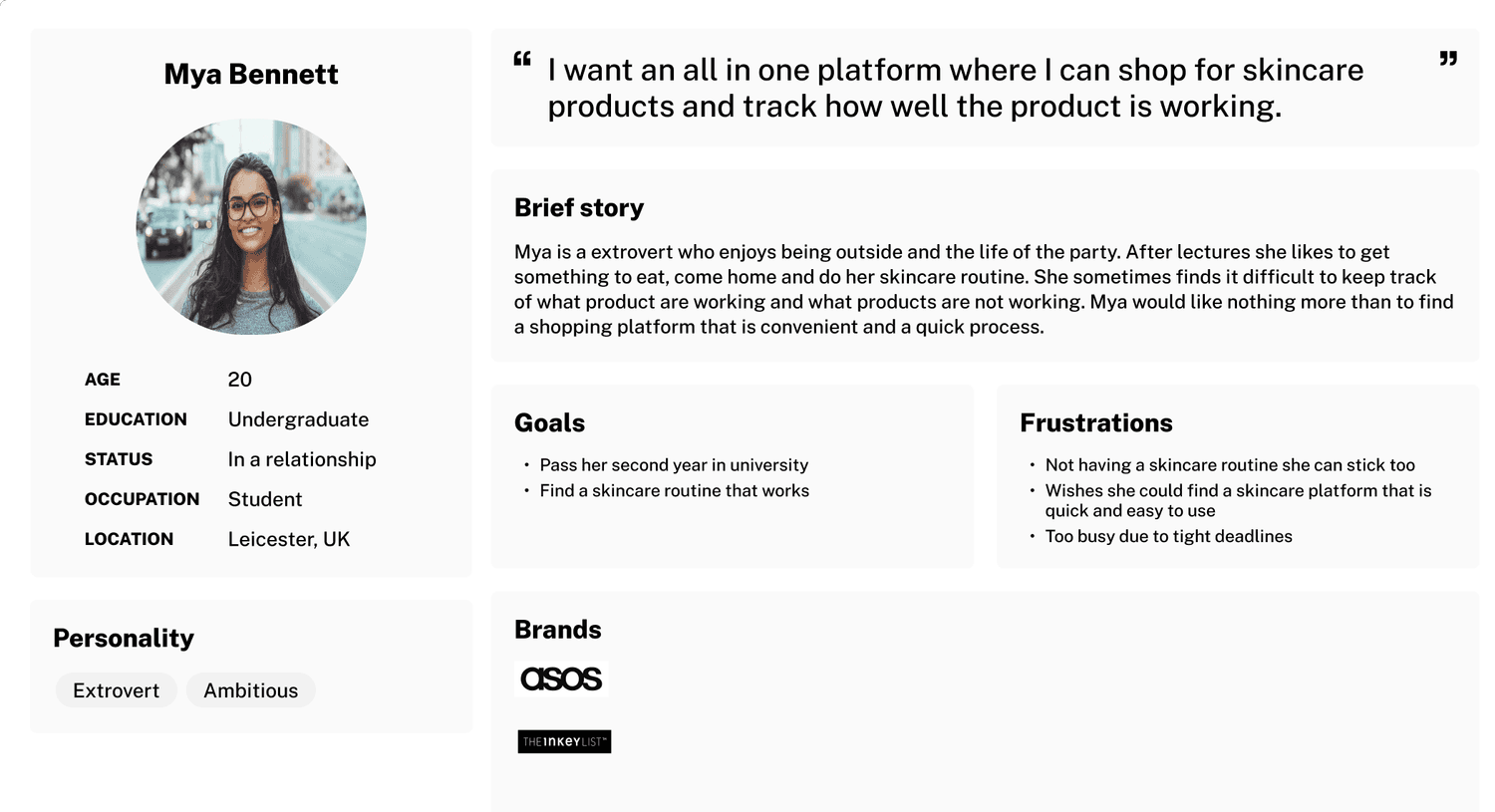
User Personas
For the next stage of this case study, I needed to visualise the users and understand their frustrations, needs, and backstory so I created a user persona to do this.
Ideation
Mind Mapping
To start the ideation process, I gathered and organised my ideas into a mind map. This helped to structure my thoughts systematically, providing clarity and organisation - it’s also really fun and refreshing to create!
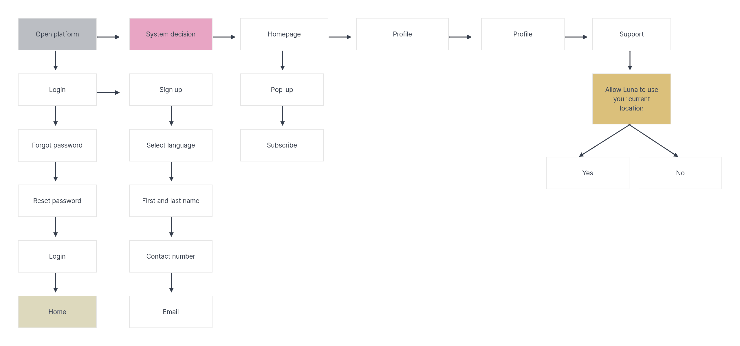
User-Flow
The next stage of the ideation phase is conducting a user flow. A user flow is essential to visually understand how the user will be able to navigate through the app effectively, whilst showing the appropriate steps to take. In this user flow (seen below) I created a clear path from the start (login) to the end (support).
Crazy 8s
Next, I moved on to the final ideation stage: Crazy 8s! This fun design sprint method involves setting a timer for eight minutes and sketching eight ideas within that time. The goal is to encourage creativity and generate a range of design solutions.
I identified sketches two, three, six, and seven as the most effective. I’ll build on elements from each design when creating wireframes to ensure they are aesthetically pleasing, functional, and user-friendly.
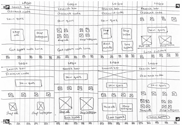
Low-Fidelity Wireframes
To carry out my low-fidelity wireframe, I outlined the features that will be included in my design.
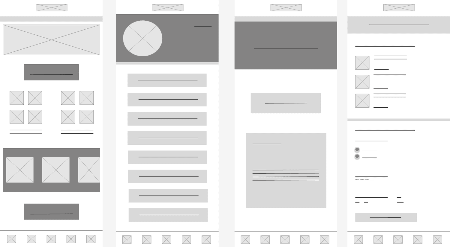
Mid-Fidelity Wireframes
To create my mid-fidelity wireframe, I expanded on the low-fidelity design by adding key elements such as text, icons, buttons, spacing, and logos, giving a clearer sense of what LUNA Skin will look like.
High-Fidelity Wireframes
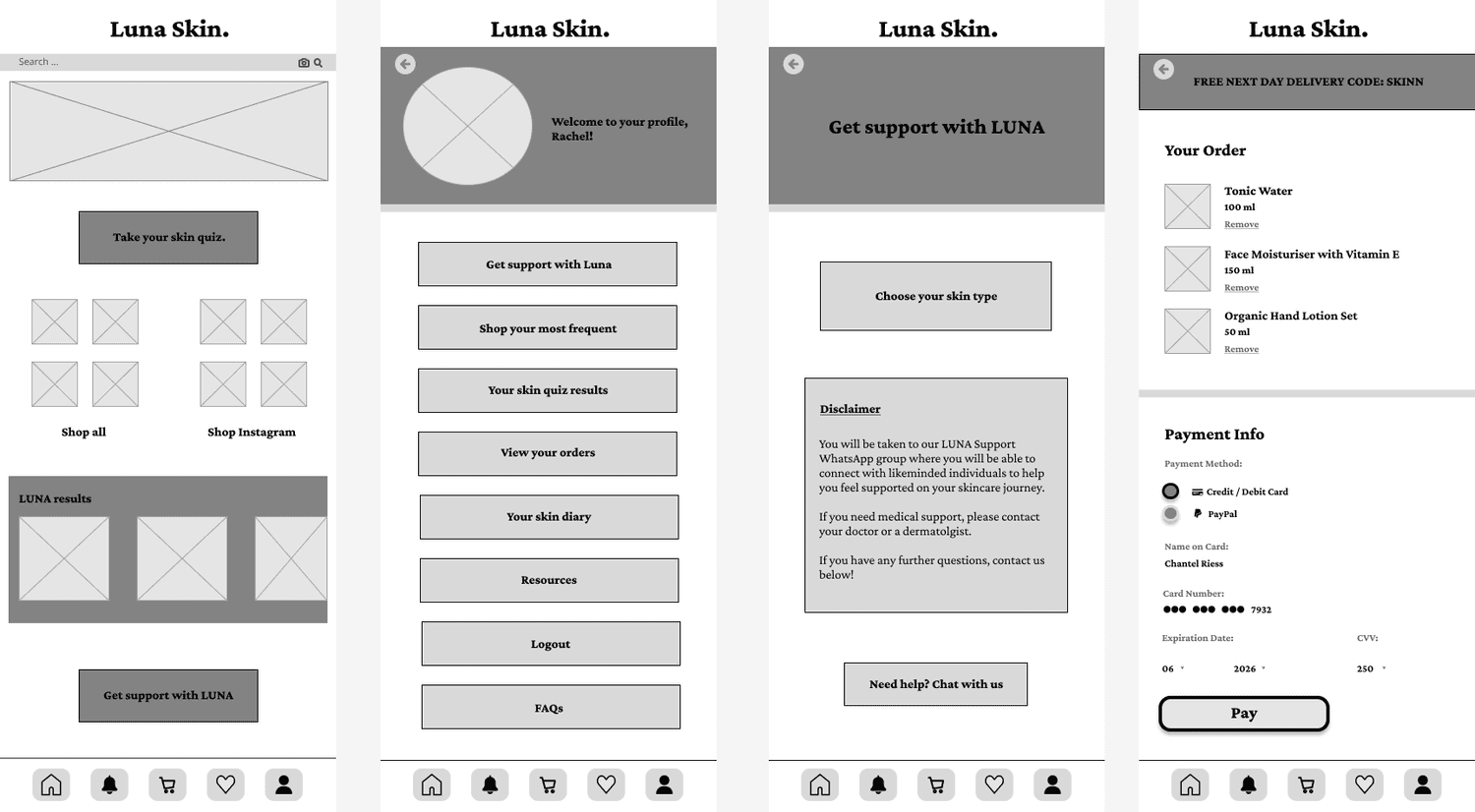
The final step was creating a high-fidelity wireframe, which allowed me to visualise a realistic version of the platform. I used feedback from the user questionnaire to ensure the text and images were correctly placed and the user journey was as simple as possible. As shown in the wireframe below, I applied Miller’s Law in all three designs, grouping options together for easier navigation. I opted for slightly rounded buttons with coloured borders, as they are more clickable and stand out compared to regular rectangular buttons. I initially experimented with rounded images but reverted to square ones as they fit better. Overall, the bright, vibrant colours are designed to attract and engage users.
Final UI Designs
Design Principles
In my design, I ensured the most important elements were positioned at the top to establish a clear hierarchy, making navigation intuitive. I maintained consistency by using the same icons across all pages of the app. User-centricity was key, as I incorporated user feedback from research and made the app accessible to all users, including a dark mode option. I considered the context in which the app would be used, ensuring the design was suitable for various circumstances. Accessibility was prioritised, ensuring the design was easy to navigate for all users, including those with disabilities. Lastly, I focused on usability, refining the design based on feedback to ensure it was user-friendly and engaging.
Style Guide
The next stage was creating a style guide to document the design elements used. This ensured consistency throughout the design and helped establish the brand identity, making it easier for reference and handover. I focused on a bright and bold aesthetic to make the app stand out, as my research showed that many skincare apps use vibrant colours. Drawing on colour psychology, I selected shades of purple and pink to convey a sense of playfulness and sophistication.
WCAG Requirements
It was crucial to adhere to WCAG requirements when designing the app, as the Gov.uk Service Manual highlights that 1 in 5 people in the UK have a disability, which could be visual, hearing, motor, or cognitive. Accessibility must be considered from the start, as every user has different needs based on their circumstances, such as location, health, or device type. To ensure the app’s accessibility, I focused on making it usable for as many users as possible.
Colour Contrast
According to UX Pin, around 300 million people globally have colour blindness, and 2.2 billion have visual impairments. To address this, I used the A11y Figma plugin to check colour contrast and ensure my design met WCAG level AA and AAA requirements. This was crucial for making the design more accessible and ensuring it stands out for users with visual impairments.
Final Designs
The solution:
Mobile app compatible screens including the home page, profile, support page, and checkout
Dark mode
Desktop compatible screen checkout
Overall Thoughts
To make my skincare platform as user-friendly and accessible as possible, I conducted thorough primary and secondary research to identify user needs and set clear goals. The LUNA Skin platform successfully meets these goals, offering a seamless experience for all skin types with a trusted support system and easy navigation. It includes a support group, dark mode, a clear homepage, and a visually engaging design suitable for users with various disabilities, particularly those aged 16–35.
One challenge was selecting colours that aligned with the brand while meeting user needs. I experimented with different shades of purple and pink to reflect the brand’s psychology. In the future, I will use time-blocking to manage colour experimentation more efficiently.
Thank you for reading.